Trigger Marketing Tips: Skyrocket Conversions With Exit-Intent Popups
How do I get them to stay? This question puzzles the mind of every business owner out there.
Every time a visitor lands on your website, the battle to keep their attention glued to your content begins. And it’s ongoing! Your opponents include everything from 2-3 active social media platforms, interrupting users as they interact with your offers.
A well-made exit-intent popup is one way you can keep your audience hooked. This automated trigger detects the slightest movement a visitor makes on your website. When they are about to leave, it launches a website exit popup, roping users in.
To improve website engagement and boost conversions, check out the text below. Make the most of your customer journey with the latest tips and tricks!
How Does an Exit Intent Popup Work?
The whole point of trigger marketing is to track the movement of every website visitor’s mouse or fingers. Once they scroll up, scroll down, or try to leave the website, they trigger a specific popup.
In other words, every time a visitor wants to leave your website, an exit-intent trigger catches them in the act. Then, a popup appears, in an attempt to make a person do one more thing before ditching you.
On desktop devices, an exit popup shows up every time a visitor hovers over the X button, usually located at the top of the screen.
This method is not applicable to smartphones and tablets because there are no mouse movements. Instead, the exit intent is triggered by scrolling with your fingers. Since exit intent on mobile works in a way that is so much different than on desktop, a quality popup-building platform has to account for different devices.
Pop Up Exit Intent Automation
It is important to note that this process of triggering popups is entirely automated. Therefore, regardless of whether your website has hundreds, thousands, or millions of followers, they will all receive equal treatment. The exit intent technology will maximize the lifetime value of every single website visitor. It also makes the overall user experience more fluent and intuitive.
Exit-intent Personalization: Design Choices
Here are some things the exit popup scripts try to make users address before they leave:
- Shopping cart abandonment
- Feedback surveys
- Collecting data (name and email)
Depending on the type of website and the type of content you are placing, you will use one of these exit popup types.
Either way, you should be able to create a highly personalized popup, one that will not stand out from the rest of your website. This means using the exact color palette and voice you see on the rest of your website.
Without any coding knowledge, you can build highly customizable digital marketing campaigns using an intuitive interface, and a human partner. In the examples below, you will see three exit intent popup examples. Every example features popups built using the Zoom Engage (ZE) platform.
Three Exit Popup Examples
As mentioned above, almost every exit intent popup example falls into one of these three categories: survey, cart abandonment, or data collection. We will give you examples for all three. Keep in mind that all three instances work as exit intent mobile campaigns as well, as optimization is an important part of every digital marketing campaign.
Cart Abandonment Popup Example
On an eCommerce website, shopping cart abandonment is likely one of your biggest concerns. The average global abandonment rate is a whopping 69.82%! A well-designed, relevant exit popup can help you reduce the number of abandoned items, and increase sales.
Check out the example below.
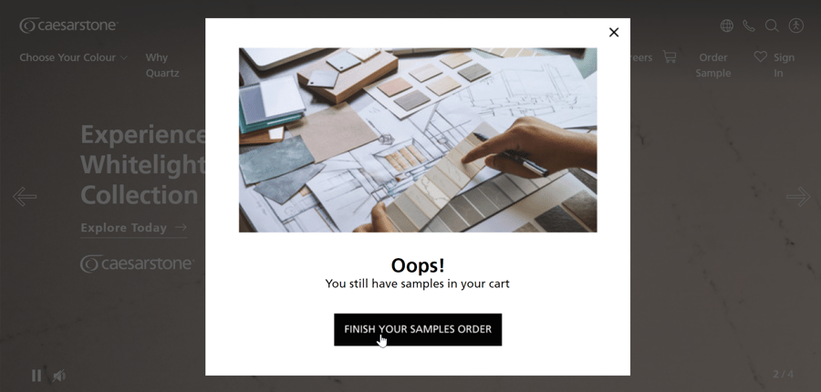
 Image 1, Exit-Intent Popup, shopping cart abandonment
In the image above, you can see a simple, elegant design solution. It is a highly contrasted black-and-white popup with a high-resolution image and a darkened overlay. The shaded background eliminates distractions, helping the user focus solely on your popup.
Putting an item in a shopping cart is as close as users can get to converting into customers without making a purchase. After all, in order to place anything into a shopping cart they first need to browse your website, check out different options, and decide which one they like best. You should not give up on a lead who has invested so much time and effort into your products or services.
A popup is, therefore, your chance to make users stop and reapproach their items with enthusiasm.
Discount Code Exit-Intent Popup Example
Another useful customer acquisition tactic is bargaining! Just before a user leaves your website empty-handed, you can try to lure them back with a discount.
Ideally, you would sell your products and services at the full price, but a bargain is always a worthy second-best solution since high costs are some of the most common reasons why people opt out of buying stuff.
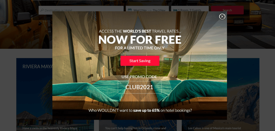
Check out the example below for an exit-intent popup on a tourism-oriented website. It offers a discount code:
 Image 2, Exit-Intent Popup, discount codes
Unlike the previous example, this popup has a background photo without any empty spaces. The easy-to-read font and the eye-catching, red CTA button make your offer effective and clear. The high-resolution background photo gives the impression of a peaceful, relaxing getaway, at your fingertips. The overlay is also darkened, in order to make it easier for users to focus on the popup.
Newsletter Exit-Intent Popup Example
A newsletter popup is one of the most fruitful ways to provide free value to your users. If, for example, you sell fashion items and luxury apparel, a periodical bulletin with the latest trends and news from the fashion world would do wonders for your brand. Showing your leads that you are there for them even when they are not actively spending money on your product or service helps build authority and establish a unique brand voice.
Check out the example below:
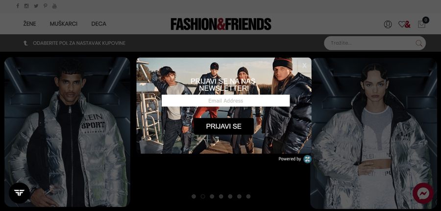
 Image 3, Exit-Intent Popup, newsletter
One of Zoom Engage's best Newsletter popup examples, this Fashion&Friends marketing campaign offers a newsletter subscription in exchange for data. The background image as well as the typography match the brand's original voice, present on all the other website pages. The popup also includes a highly contrasted black-and-white CTA button, as well as a darkened overlay.
Businesses from around the world have used the Zoom Engage platform to build all three popups you can see in the examples above. Even though the marketing campaigns are similar, they fit their respective websites like a glove.
Remember, the best exit intent popups out there are sleek, elegant, and just flashy enough to grab your attention. Their highly customizable features enable business owners to adjust the purpose and aesthetics of every popup to their specific goals. Attain any marketing goal, whether it's boosting engagement, sales, or an email list!
Final Words
Desktop, as well as mobile exit intent popups, can help you enhance your sales plan in several different phases of your sales funnel. Customized marketing campaigns pop up when leaving sites in a variety of industries online. If you plan on building an aesthetically pleasing, easy-to-use, and efficient exit intent popup, check out ZE's website, and schedule a demo. You'll get a chance to speak to your human partner, and test the platform. Good luck!
