The Types and Uses of Website Carousel Design (With Examples)
These days, people browsing through crisp, high-quality websites, expect to see at least one carousel.
This goes for some of the most successful conglomerates in the world and small businesses alike. Everyone from Netflix and Youtube to your local nail technician is using carousel designs on their website. If you want to sit at the cool table with the popular kids, you need a glistening, well-designed image slider. Show your website visitors that you can, and will go the extra mile to impress and engage them.
In the text below you will find out What is a carousel post? why we use carousels, how they differ from sliders, and which types of carousel posts benefit your business.
The Uses of Carousel Design
The two main uses of carousels as a design solution are engagement and sales. The sales-oriented part can sometimes overlap with marketing, depending on the particular campaign. The interactive carousel design prompts website visitors to take control of their user experience, and further explore your website.
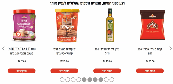
As for the sales-focused carousels, you can expect a series of high-resolution product images, as well as clickable CTA buttons, along with short product descriptions. You could, for example, find these photo carousel posts on eCommerce websites.
 Image 1: Grocery Website Carousel, eCommerce
As for marketing-oriented carousels, these could only include high-resolution images, showing off the best aspects of your business, and increasing brand awareness. For instance, carousel marketing on a travel website might contain a set of pics describing exotic destinations along with luxurious hotels.
 Image 2: Tourism Carousel, Marketing
Website carousel designs combine multiple high-quality images, videos, and/or text to create a slideshow. The carousel slideshow can move automatically, or it can require manual navigation. Both options are usually possible, even though fully manual carousels have been gaining traction in recent years.
The Types of Carousel Design
This feature offers a huge number of design variants. You’ve got card carousels, broken grid carousels, full-screen image carousels, movie posters you can see on Netflix, etc. You even have sliders, which are a kind of carousel that only allows you to see one picture, or piece of content, at a time.
Carousels that only contain pics, pics, and some text, as well as CTA buttons. The point is that different types of carousels largely depend on the platform you use for building them.
In this article, we will be showcasing examples of website carousels you can build on the Zoom Engage (ZE) platform, with little to no coding knowledge.
In-Page Carousel With Size Option
This kind of campaign is a part of the Shopping Cart Zone; A website visitor is able to choose the precise size and color of the desired product, and add it to the Shopping Cart.
Image 3: Tourism Carousel Marketing Video
This campaign's goal action is to boost sales, by helping prospects make up their mind about a purchase by choosing between several variants of the same product.
In-Page Brand Carousel
In-page brand carousel campaigns are located on the Home Page. By clicking the desired brand image, a prospect lands on the respective brand page. This kind of carousel obviously works well for outlets which sell a variety of famous brand names.
Image 4: In-Page Brand Carousel Video
The point of this carousel UX design is to increase sales, strengthen brand awareness, and improve the overall user experience on the website in question. An outlet working with big brands will want its visitors to be able to take their pics of products based on the brand names.
Tabby Carousel Slider
As is the case with any slider, this tabby (a small tab, a term of endearment) campaign only shows one picture at a time. Moreover, the campaign is subtle, unassuming, and small when compared to the rest of the website real estate. This is why, even though it cannot be minimized, it doesn't cause bad UI design.
Image 5: Tabby Carousel Slider, Video
By clicking the arrows, the website visitor can access other images. The idea behind creating this campaign is to promote new products. Marketing and engagement are the priority with this one.
Tabby Carousel
Unlike the slider, the tabby carousel allows website visitors to minimize the campaign. This minimizes its potential negative effects on the user experience. The items on the carousel are clickable, so the visitor can easily convert and add a product to cart.
Image 5: Tabby Carousel Slider, Video
Additionally, the website visitor is able to reopen the tabby if they want to check the products again.
Social Media Carousels
Some social media platforms allow you to easily create and post carousels as a part of their regular, free interface. Nearly every Facebook carousel ad, Linkedin carousel ad, and even Pinterest carousel ad will likely look similar, and there isn't much customization you can count on. Instagram carousel is the star of this social media craze, and we advise you to search for design inspiration from these huge, successful platforms.
Customized website carousels remain an indispensable part of your website design. They are still the best way you can complement your unique brand identity, build authority and increase conversions.
Build the Best Carousel Ads With Zoom Engage
You can easily build all of the carousel and slider uses and types mentioned above using the Zoom Engage platform. The platform interface design is highly intuitive and requires little to no coding knowledge.
Everything from different carousel design patterns, background color, image sizes, special effects, targeting, and the carousel ads size is highly customizable.
Contact Zoom Engage's dedicated Customer Success Manager if you need any recommendations, guidance, or simply a kind pat on the back to remind you that you are doing a good job.
