The Pros and Cons of Website Carousel Design: How to Get it Right
Visually stunning, interactive, and dynamic – website carousel design can really make your content POP. But before including this feature on your website, ask yourself: Does this add more value to my website than static text and images?
What Is a Carousel Post
Website carousel designs combine multiple high-quality images into one ad or post. The pics line up in a single frame and take turns sliding to the left and/or right, and in some cases, up/down.
It allows people to slide through several product options, and get a taste of what your business has to offer on their own terms.
Depending on the carousel itself, the pics can slide automatically, or website visitors can swipe for themselves to reveal more content.
This makes the carousel design interactive, prompting website visitors to take control of their user experience. Additionally, galleries allow online businesses to showcase a myriad of products and services in a compact space.
Sometimes, carousels contain GIFs and videos, but this is more of an exception than a rule. Due to their sleek, pleasant visuals as well as economical use of space, carousel ads can result in a 72% higher click-through rate, according to some studies.
Today, an Instagram carousel ad or a Facebook carousel ad pops up when you try to google this design option. Still, this ad format is becoming increasingly popular on more ambitious websites, the ones trying to provide a more modern, dynamic, and interactive user interface (UI).
The Cons of Carousel Website Design
Displaying this sort of visually stunning content while saving space on a website page is tempting for many business owners. But let’s start with the bad news.
Either way, you need to tread lightly. Make one mistake, and you’ll end up severely damaging your UX.
Here are the Potential Disadvantages of Carousel Ads you need to look out for:
- Website visitors miss out on important information.
- Carousels stand out too much from the rest of the website.
- Causing difficulties with accessibility.
- Difficulties with finding high-quality images to display.
- Users falling victim to ad blindness.
Putting information that is integral to your website in a carousel is a terrible idea. Putting discounts on a slider, for example, would render them close to useless. You don’t want your customers to have to hunt for this important, convertable data.
Additionally, carousels might be difficult to use for people with motor skills issues, which affects your website’s accessibility. Pictures sliding automatically can be overwhelming, and difficult to control.
Finally, for this whole thing to work, you need to display staggeringly beautiful image sliders. This means high-quality and professional photography.
The Advantages of Carousel Website Design
The good news is – none of the above has to matter. If you build a carousel the correct way, you can maximize its potential and reap the benefits without backlash.
You’ll get a chance to tempt your visitors further with a variety of gorgeous items of content at once, with breathtaking pics. And therein lies the importance of using your extravagant spicy trick in moderation.
The Unique Advantages of Carousel Ads:
- Displaying multiple products or services at once.
- Elevating your website design to a more modern look.
- Accentuating content such as reviews and testimonials.
- Saving room on your website for the more structurally relevant content.
- Ultra-wide, quality carousel images can be breathtaking.
Build a carousel correctly, and it can skyrocket your website into a more slick, dynamic, state-of-the-art world of contemporary design.
Additionally, it's important to steer clear of autoplay image slider commands to produce an acceptable user experience. Either have the slider images move slowly, or only allow manual operation via arrows or other navigation tools.
If you happened to own an apparel website, a carousel would be a great way to draw audiences in with a continuous spectrum of sliding images. An eCommerce carousel allows users to make a purchase, so it could be directly profitable. Alternatively, you could just be using it to display varying product options, putting users in the mood for exploring further.
Clicking through your carousel ad designs increases website engagement. Even if website visitors simply swipe left or right and don’t use the carousel to make a purchase, this positively affects your bottom line.
Final Words: How to Get it Right
Typography, carefully curated color palettes, attention-grabbing buttons, and high-quality images tie the whole slider UI design together.
In the video below, you can see some carousel website examples built using the Zoom Engage (ZE) platform.
Image 1: Interior Design Carousel, Video
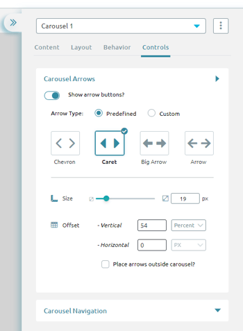
Platforms such as Zoom Engage allow you to easily customize every smallest detail of your carousel according to your wishes. Everything from the carousel arrows' shape and size, to behavior, dictating automatic or manual carousel ad specs control is up to you

Image 2: Carousel Controls in the Zoom Engage Interface
Ultimately, the high level of customization enables you to avoid all the pitfalls of clumsy carousel UI design, and leverage the pure aesthetic bliss of doing carousel web designs justice.
