Catapult Your Website Conversions With Entry Triggers
An entry popup shows up when users enter your website. It’s that simple.
It usually appears on your Homepage. Still, it’s not that uncommon to see this campaign on other website pages.
It’s important to note that entry popups can be a controversial choice. Some digital marketers advise against it, suggesting that it’s too overwhelming.
After all, isn’t asking a random visitor to convert before they even got a chance to interact with the rest of your website risky?
Not in our experience.
Check out the text below to find out how entry popups work, and why they can catapult your conversion rate in no time.
What is an Entry Popup and How Does it Work?
The entry popup might be visible to first-time visitors as well as repeat customers. Now, depending on what you want to accomplish, this popup might overshadow the rest of your content, or be more subtle. Either way, you are dealing with a trigger campaign, a type of automated marketing tool. Once you build it, it will work for thousands, even millions of users.
Entry Popup Examples
As we mentioned, there are degrees to how intrusive entry popups can get. Sometimes, it blocks the user’s view of your website by obscuring the overlay.
n the example below, as soon as the popup shows up on the screen, it takes up the center position, and the overlay darkens the rest of the content. This makes it easier to focus on the popup. Now, this kind of campaign might look too aggressive at first glance.
However, we encourage you to take a closer look at the content:
Image 1: Entry Popup, Data Collection
The title question, "Interested in working with us?" aims to pique the interest of business owners, i.e. companies that want to get their hands on a monthly dose of caffeine.
Why is this beneficial?
A user who is a business owner will find the popup extremely useful, as it eases them into making a purchase by asking for their preferences. The survey first wants the user to identify as either a cafe, a hotel, or a restaurant, and then proceeds to the precise dosage of 30, 100, or more coffees.
On the other hand, an individual user who just wants a single cup for themselves can simply click the very apparent X button on the upper right corner of the popup, and move on to the website.
See? Already, we have an example of an effective, highly convertible entry popup. And it doesn't damage the user experience (UX) at all!
Trigger Marketing Example: Social Media
As mentioned above, more subtle entry marketing campaigns can coexist with the rest of your page content in peace. For example, you can use the entry trigger campaign for social media links!
Check out the example below:
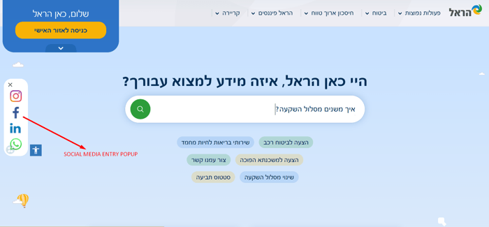
 Image 2: Entry Popup, social media
The example above shows a social media entry popup. The moment a person lands on the Homepage, they get a chance to see a popup that looks like an organic, static part of the website. The website is in Hebrew, but it's easy to understand how the design elements come together to convey a message.
The social media icons are placed vertically, showing the easily recognizable logos for Instagram, Facebook, and WhatsApp. The point of this entry popup is the click-to-call option for WhatsApp and the active SM platforms for the rest. Clicking any of these options helps users get familiar with the company's voice, values, and promotions in a unique way. Ultimately, the goal is to build the brand's authority.
Trigger Marketing Example: Customer Support
Another example of an inconspicuous entry marketing campaign is customer support. The moment a person lands on one of Widewalls' website, a small, pink tab appears in the bottom right color of the screen. This campaign's color matches the fucsia "log in" button we see on the website, as well as the linked "follow" option under each picture.
Image 3: Entry Popup, Customer Support
The users scrolling Widewalls' website can easily notice the "Can We Help?" tab. By clicking it, a website visitor gets a chance to ask a question or send a message. This helps the brand enter into direct communication with leads, and address any potential concerns. It also grows the brand's email list!
Trigger Marketing Example: Free Shipping
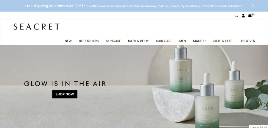
Another example of an effective entry trigger is Seacret's Free Shipping greeting bar. The digital marketing campaign promises free shipping on orders over a certain cost. It does wonders for enticing website visitors to make a purchase in a specific price range, without interrupting their user experience.
See the example below:
 Image 4: Entry Popup, free shipping
The gentle, baby blue color of the greeting bar at the top of the screen fits perfectly with the website's blueish and greenish white. The white letters are contrasted enough with the background to stand out and remain easy to read. The entry trigger works perfectly for this marketing campaign, as it displays the kind of information that gently nudges users to convert.
This lovely design choice shows how effective custom entry popups (i.e. greeting bars) can get when they are put in the right hands.
Trigger Marketing Example: Shop Early Discount
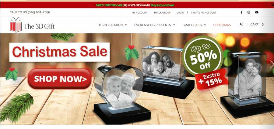
As you can see in the image below, the 3D GIFT website is bursting with colors, unlike our previous example. Its greeting bar entry popup is, therefore, built to match this energy:
 Image 5: Entry Popup, Shop Early Discount
The red greeting bar with green and white letters complements the website's Christmassy theme. It also makes the massive discount pop with its bold copy. It is attention-grabbing and activated upon entry. The marketing campaign itself is yet another example of how an entry popup can enhance the user experience, instead of ruining it.
Entry Popups Do Not Deserve the Bad Rep
Entry popups are infamous in the world of digital marketing. People view them as an annoying plague on your website pages that ruins the user experience and even causes banner blindness. As you can see from the examples above, this only happens when you do a lousy job building them.
The marketing campaigns in this text show how trigger marketing can engage audiences effectively the moment they enter a website. Discounts, free shipping, lead generation via customer support and social media buttons, as well as B2B surveys that boost sales can all bring amazing results for business owners.
All you need to do is build customized entry popups that match the voice and design choices in the rest of your website. All of the examples above have been built using the Zoom Engage (ZE) platform. You can easily customize everything from the color and shape of the marketing campaigns, to the trigger marketing rules and popup placement. All that, without any coding knowledge!
These extensive personalization feature make all the difference between banner blindness, and successful conversions. If you are interested in checking out what the ZE platform can do for you, feel free to schedule a demo and get in touch with your very human future partner who can show you the ropes.
