7 Best Practices to Generate More Leads on Your Website
Most organizations work hard on bringing the right traffic to their website without putting enough thought into converting those website visitors into actual leads on their CRM or email marketing platforms.
Assuming you already have adequate traffic coming to your website, we decided to share the 7 best practices to help you convert website visitors into leads. Apply these tips, and you can expect a higher conversion rate, both on desktop and mobile, for paid traffic and organic traffic alike. Eventually, following this approach will allow you to reduce your cost-per-lead and improve your ROI for paid campaigns.
Being that 70-80% of website visitors come from mobile devices, it is crucial to optimize all of your features.
So, how can you improve your conversion rate and create more leads out of your existing website visitors?
1) Use a Combination of Subtle In-Page Forms and More Aggressive CTAs and Sticky Banners
You do not want to come on as too pushy and aggressive with your visitors. Still, if you opt for an overly polite approach, you are unlikely to maximize the potential of each and every website visitor, and you would be forced to settle for average conversion rates. To maximize the potential conversion rates and acquire more leads, you will have to be assertive and use a mix of subtle, in-page, embedded lead-gen forms and more aggressive popping CTAs and forms. Being pushier with popups and other smart overlays, without annoying the users is tricky but feasible with the right approach and tools.
Let's start with the easier part – the subtle, in-page CTAs and then gradually move on to the more sophisticated, pushy popups as well as other “popping” overlays and sticky banners.
In-Page Forms
Users coming from a paid PPC campaign, a social media post, or a story, usually enter the website through a dedicated landing page; if they come organically through a search engine such as Google they usually land on an internal website page with some relevant content.
On a landing page, you probably already have a form at the top of the page. There is more to do though.
Protip: if the page is long and a user can scroll down a lot then it is recommended to add an extra in-page form at the bottom of the page or towards the bottom.
Sticky Banner Forms/CTAs
If the form has only 1 or 2 input fields (e.g. full name and email) then embed the form in the sticky banner itself. If your form has more than 1-2 input fields then add to the sticky banner a CTA button that when clicked on, will pop the full form in an overlay (e.g. a popup or a slide-in window).
Protip: add a sticky form or CTA at the bottom of the page or at the top.
On content pages where it is not relevant to add a lead form in the content itself, a sticky bar will help get more leads.
Popups and Other Overlays
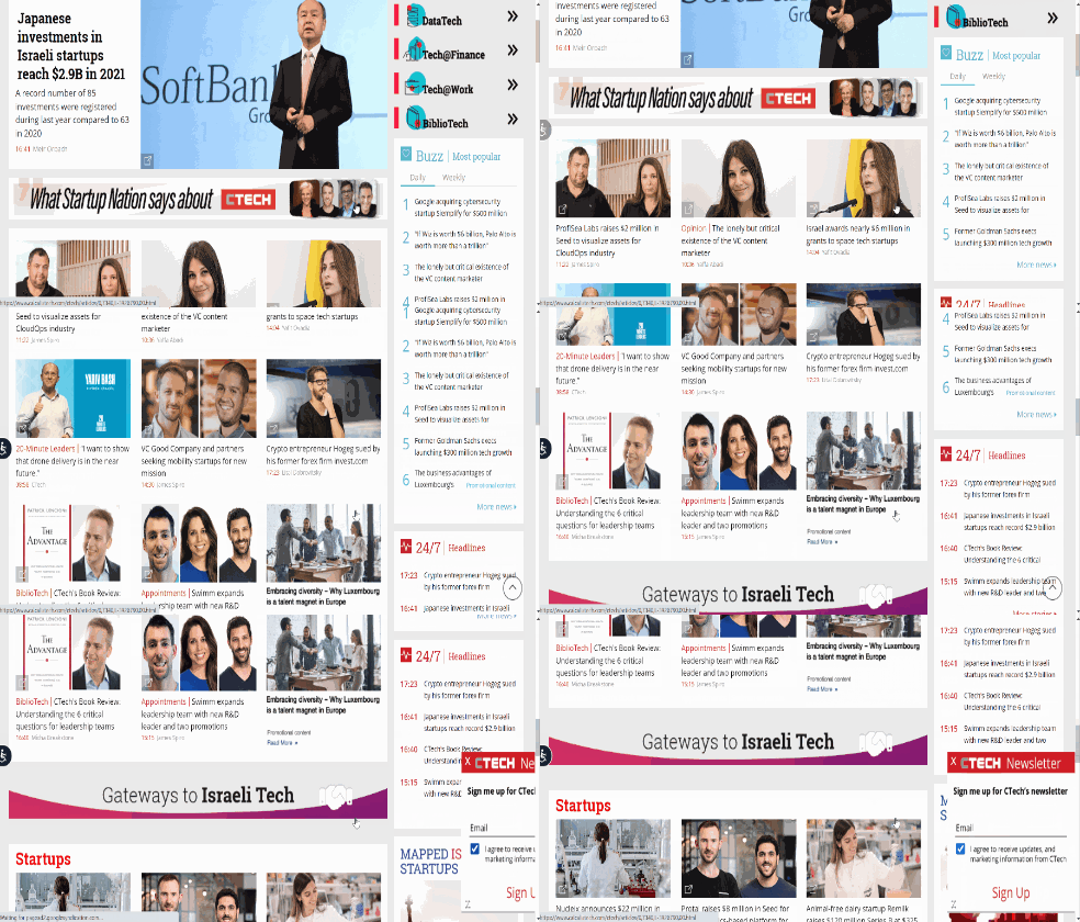
Another addition that works very well and can be in addition to the sticky bar is a slide-in window on desktop or a Mobile Widget form on mobile. These should be triggered to appear not too early on the page. On desktop adding a trigger of 50% scroll-down, works well.
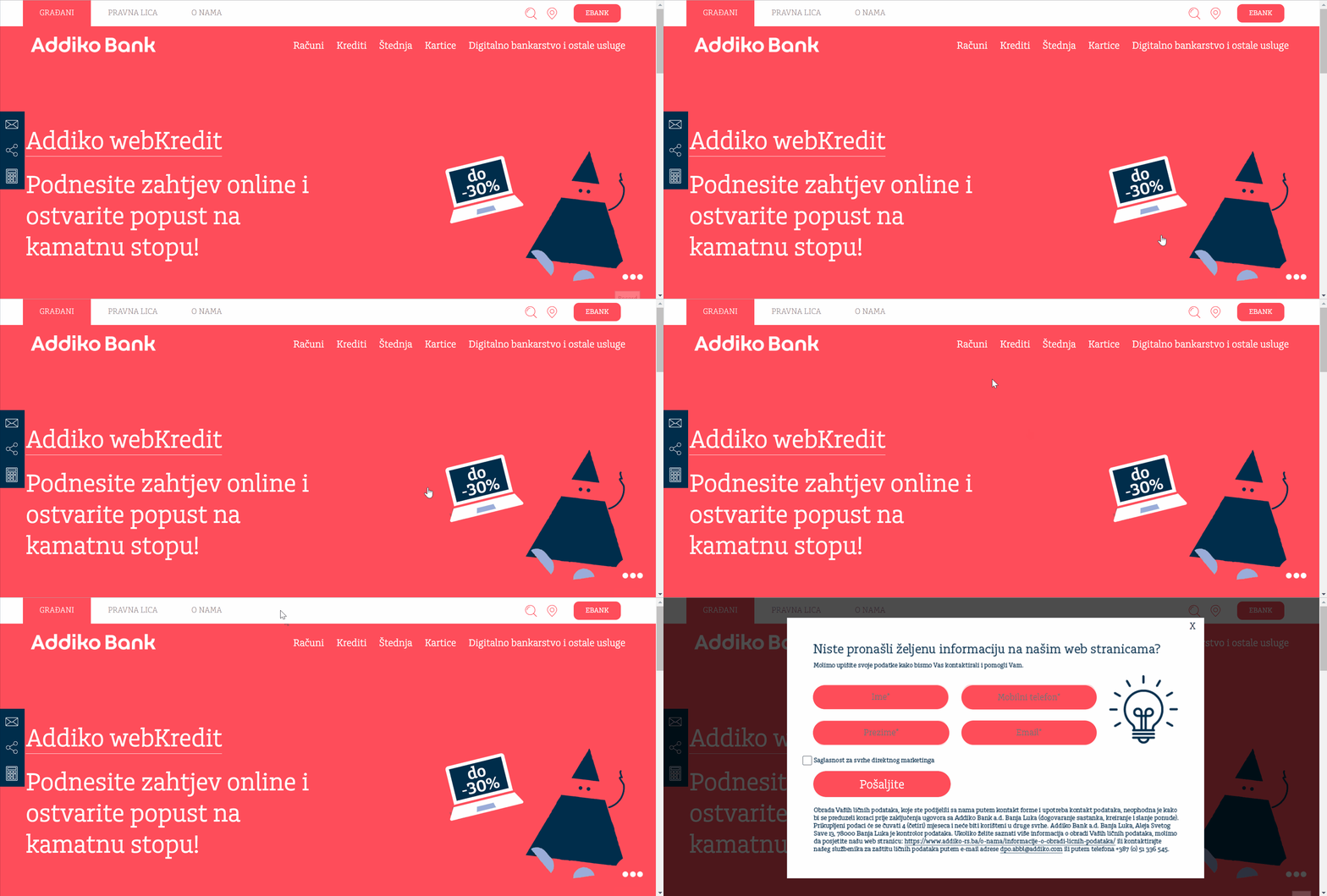
 Image 1: Exit-Intent Popup
Protip: on mobile devices you should pop the overlay form when the user starts to scroll up instead of down, indicating that they probably finished reading the page.
In order to minimize the disturbance, you can have those overlays auto-close after 3-5 seconds if the user has not interacted with the widget and has not closed it manually.

Image 2: Mobile Widget
Protip: on desktop, add an exit popup that appears only if the user has not seen yet the slide-in widget.
This is to assure that every user sees at least 1 popping form and has an easy opportunity to leave their contact details.
2) Personalize the Lead-Generation Form Based on the Visitor’s Interests and Characteristics
A one-message-fits-all is not the way to optimize lead conversions. You provide different services and have different products and categories so not all users need to get the same message.
Protip: to maximize lead conversions you should tailor the message in the lead-gen form to a specific topic the user showed interest in. During the current visit or in previous visits.
For example, if you are an Auto dealer and have several car brands and models, showing a generic “Leave your details and we’ll get back to you” form would definitely bring fewer conversions than a slightly different message to each visitor, based on the car model, brand or type he just showed interest in, during this visit or in previous visits. E.g. for users who browsed the Toyota SUV page in the last 4 weeks show a personalized message: “Looking to buy a Toyota SUV? Leave your details and our SUV consultant will get back to you”.
3) Show the Lead Generation Form at the Right Time
In-page forms are part of the page and convert well when the visitor is highly motivated to get in touch with you. But, when the user is not that sure that they are ready to leave their contact details, a more aggressive approach is needed in order to fully optimize the potential and get those I-am-not-so-sure-yet prospects to leave their details.
So when is the right moment to show that engaging popup or some other overlay?
The trick is to show it as late as possible but not too late in order not to miss the opportunity.
On content pages – blog posts or other lengthy pages, you should pop the form towards the end of the page, when the user has most likely finished going over the content. It can be for example after the visitor has scrolled 80% of the page.

Image 3: Slide-In
But many times the users do not reach the end of your great content. In that case, you need a backup plan in order not to miss the opportunity to show your lead-gen form and possibly gain another lead.
Protip: to catch abandoning users show a lead-gen form in an exit-intent popup on desktop or in a Mobile Widget when scroll-up event is detected on mobile phones.
If a user has already seen the form when they have scrolled down towards the bottom of the page, then do not show the exit popup to not overwhelm them.
4) Nurture the Potential Lead While They Are Still on the Website
A visitor needs to be ready and nurtured in order for them to leave their contact details.
Protip: if a visitor leaves your website very early (i.e. after a few seconds), before seeing your best content, offer them to see that great content instead of leaving right away. And only on that additional content page, try to get their contact details.
If all your relevant content is on that same landing page though then go ahead and try to convert them right away.
Protip: you can combine in the Exit-Intent popup (or Mobile Widget) both a content recommendation CTA and a lead form, to be on the safe side.
I.e., give the user an option to learn more about your product or service by clicking through the CTA and visiting another page, or to leave their details and learn more from your representatives, by phone or email.
5) A/B Test Different Headlines and Triggers for the Lead-Gen Forms
When optimizing conversions there is always the Fear Of Missing Out (FOMO) – the fear that there might be a better way of doing things – a better tagline, a better image, show the lead generation form at another moment, etc. That fear is not baseless and is correct. There is always an optimization that can be done. Not to settle for “good” but to look for the “excellent” is the way to go when you want to fully maximize the potential of every website visitor and get the most conversions as possible.
Protip: always A/B test different on-site campaigns. Specifically, try different personalized copy and different triggers.
For example, on desktop show the slide-in when a user scrolls down 80% of the page VS showing it after 30 seconds. You can use heatmaps to determine which tests to do.
When you try different versions of copy, make sure they are all personalized to the user’s interests, as described above, and check variations of the personalization texts. For example, “Looking into buying a Toyota SUV? Leave your details and our SUV consultant will get back to you” VS “Interested in buying a Toyota SUV? Leave your details to schedule a test drive”.
6) Do not Redirect Users to Another Page to Fill the Lead Generation Form
It is tempting to send users to a dedicated landing page in order to collect their contact details. The form on that page is already perfectly synched to your CRM or email marketing tool. If the users are already on that page, that is perfect. But what if they are now on another page which does not have a lead-gen form in it?
Protip: always collect the lead in the page the user is at now and do not send them to another page to fill their details there.
Use specialized tools that integrate with any CRM, marketing automation platforms, or newsletter systems and collect the leads through those tools, to avoid extra clicks.
Each click the user has to go through in order to become a lead reduces the conversion rate dramatically.
7) Minimize Input Fields in the Lead-Gen Form
If you want to maximize conversions, bare in mind that each additional field in the lead-generation form typically reduces the conversion rate by 10-25%.
If you have fields that are not absolutely necessary, remove them. If the website visitor leaves their basic contact details in the form, you can, later on, fill in the missing details when you get in touch with them.
When you have only the must-have fields and can not further reduce the number of fields, there is still something left to do! You can merge fields in the form itself and split them after the user submits it, just before sending the form to your CMR or newsletter tool.
Protip: instead of collecting “First Name” and “Last Name” in 2 separate fields, ask for a “Full Name” in one input field and split it automatically into 2 separate fields before sending it to your CRM.
This simple trick will get you an elevated conversion rate without losing anything.
To see how you can implement all of the above easily on our website without coding, feel free to schedule a demo with us.
